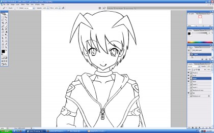
This tutorial assumes that you have already drawn something so let’s do that first. I prefer to draw on paper and redraw the lines in my computer but you can just draw directly in PhotoShop. In general, you want the size of your image to be at least twice as large as the size you plan to release it in. The one thing you want to make sure is that you are drawing on a transparent layer so that only the lines will show when all other layers are off. You may also want to keep certain features such as the eyes on separate layers so they may easily be changed.
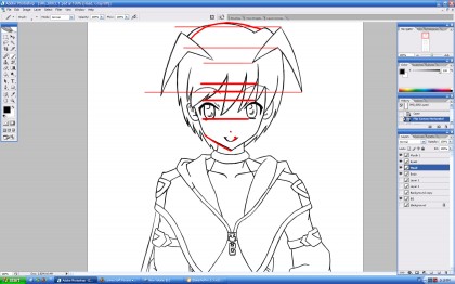
The most important part before proceeding to color and shade is to check your line work.The easiest way to do this is to go to Image>Rotate Canvas>Flip Canvas Horizontal. When the drawing is flipped, it is much easier to see any flaws in your drawing. Many people skip this step because they do not like seeing their mistakes but this is important to achieve a high quality illustration and avoid time-consuming fixes later on. As you can see here, several facial features such as the eyes are misaligned and need to be fixed.
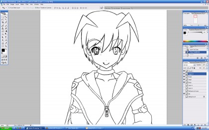
One easy way to fix this is to use the lasso tool to select an area such as an eye and duplicate it onto another layer. We then flip the eye horizontally and move it on top of the misaligned eye. (Hold shift while moving to lock its vertical position.)
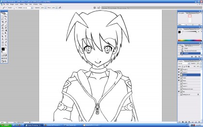
We then erase the eye underneath and merge down to create a new eye layer. After making this fix, we flip the image again to check for any flaws. It’s important to keep flipping the image periodically while you draw to check for flaws.
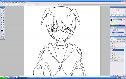
We continue to make adjustments to the drawing until it looks good whether flipped or unflipped.
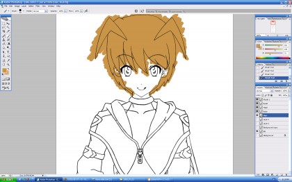
Now its time to add the base colors. First we create a new layer below the outline layers and use the brush tool to color it. You probably want to pick a color lighter than what you want because the shading will make it look darker later on.
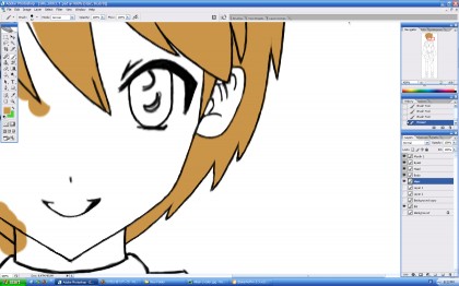
It is not important to color within the lines because it is much easier and faster to erase excess color then to try to stay within the lines. Alternatively we could use the magic wand to select an area and fill it in with the paint bucket tool but make sure to color the color layer and NOT the outline layer.
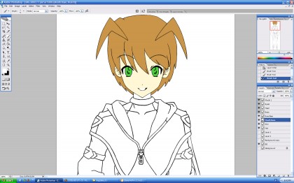
We repeat the same procedure for all the other colors until we have finished the bases. You can keep all the bases on the same layer but I prefer to have them on separate ones. I also keep the eye color base on its own layer.
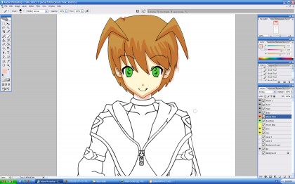
Next it is time to apply the shading. We create a new layer on top of the base colors but below the outline and set it to “multiply.” Then we choose a light pink color and use it to shade the drawing. In this drawing, I wanted the light source to be located to the upper left so we apply the pink mostly to the bottom and right edges.
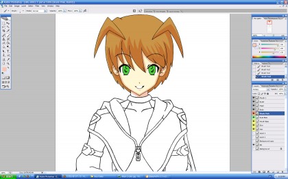
Again it is not important to stay in the lines since we can just erase any extra later. Remember, the eraser is just as much of a drawing tool as the paintbrush is.
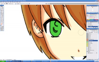
To add another level of shading, we create another layer on top of the primary shading layer and set it to multiply. Using the same pink, we shade within the boundaries of the primary shade layer.
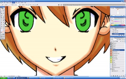
For certain colors like white, I prefer to use a light blue color to shade. We follow the same procedure as outlined above making sure to keep them on separate layers.
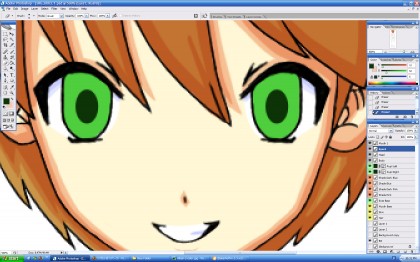
Once the shading is done, it is time to move onto the eyes. We start by sampling the base eye color and using it to pick a darker shade, in this case a dark green. We then use the ellipse shape tool to create the pupils. It’s best to make one pupil first and duplicating it to maintain size consistency between both eyes. Before proceeding further, you want to make sure the pupils are positioned so that they are looking in the correct direction. Looking a little Higurashi there, Canan.
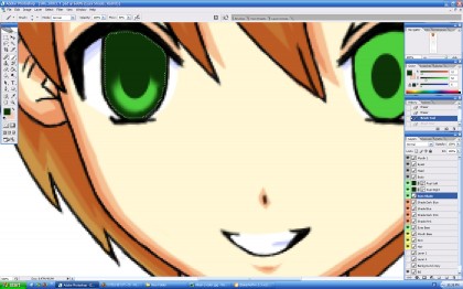
We pick one eye to work on and use the magic wand to select the area within the eye so that we do not color any excess. We create a new layer and using the same shade as before airbrush the eye as shown above.
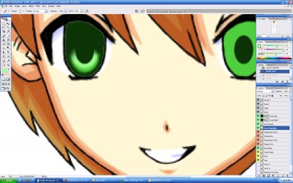
We then create another layer set below the eye shading layer and pupil but above the base eye color. Using a lighter shade than the base, we airbrush the area directly along the lower edge of the pupil.
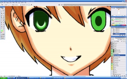
You may also want to play around with dodge tool to lighten the color and give the eye a more glassy feel.
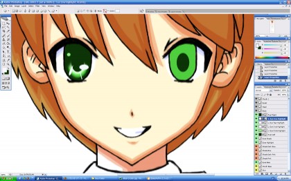
To finish the eyes, we need to add some highlights. Using the shapes tool and an off-white color, we create the highlights as illustrated above. You can arrange these shapes in many different ways to suit your style. In my case, I try to imitate KyoAni’s eye-style.
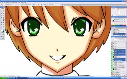
To save time, we can just copy one eye to create the other. Ctrl+click all the eye elements except for the base eye color and the pupil from the uncompleted eye and right-click>duplicate. Move the duplicates over to the uncompleted eye and make adjustments until they are in perfect position.
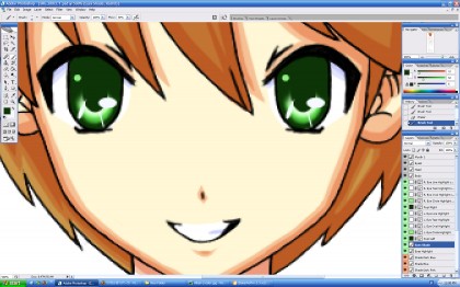
We fix the edges of the second eye using the eye shading color until it looks perfect.
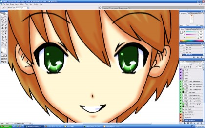
You can perform this next step earlier but I prefer to do it before applying highlights to the rest of the body. Using the blur tool, we smooth out the edges of certain areas to create a smoother transition between shades, You may not want to blur out all the edges such as along strong bends in clothing. You can also experiment with the smudge tool but excessive amounts tend to make a drawing look funny.
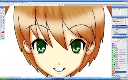
The last step is to apply highlights. We create another new layer above all the others except the outline layers. With a lighter color than the base, we use a large airbrush to color the area we want to highlight.
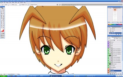
We then use the eraser to remove the bottom half of the line we just painted and part of the top to create a slight gradient within the highlight. You can of course arrange the highlights to suit your style but I prefer to keep them simple and to a minimum.
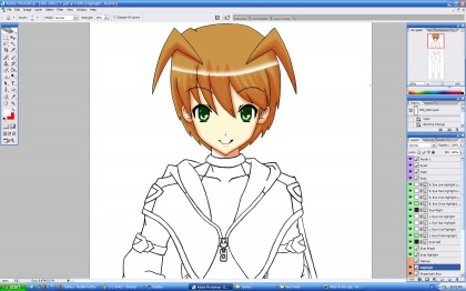
Now that you have finished you can zoom out and look at your drawing and be proud of what you did. I hope I inspired some people to try drawing or at least keep on trying with this article. Please continue to try your best and I hope to see everyone else’s art in the future!

4 comments
Skip to comment form
God, now I feel bad about my lack of drawing skills 🙁
Zeroblade’s last blog post..Ever17
I’m no artist, but I sure thought this little tutorial was interesting. On another note, do you need me to come up with a general set of colors for Canan’s costume now?
You’re doing a great job at both outlining and CG, I think there won’t be much problem. Btw, what do you think about coloring lineart? Will it be more trouble than its worth?
Honya, I’m confused about the method to contact you effectively. I want to upload some sketches, but can’t login/check my account at honya-ch.com. I think it’s lost somewhere. XD
@Zeroblade: Don’t feel too bad. If you want I can look at your work and give you some advice.
@Citrus: Don’t worry. I already have her color scheme in mind. It will match the TIP Alternative picture I did.
@Raide: I have actually considered coloring the lineart. Although it looks good, It would probably be too much trouble to do that for the character CGs unless we have a lot of time near the end of production. However I think it would be fine to do that for the event CGs. I actually want to ask your advice for how to we want to color the Event CGs.
As for the log in issues, I will resolve that as soon as I can.